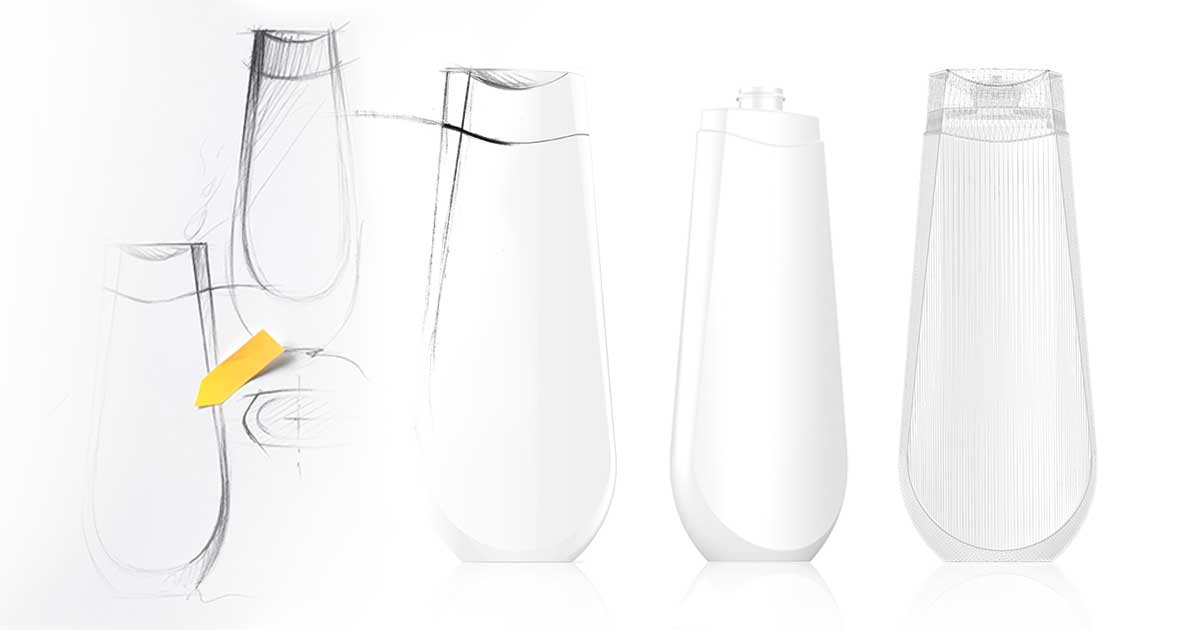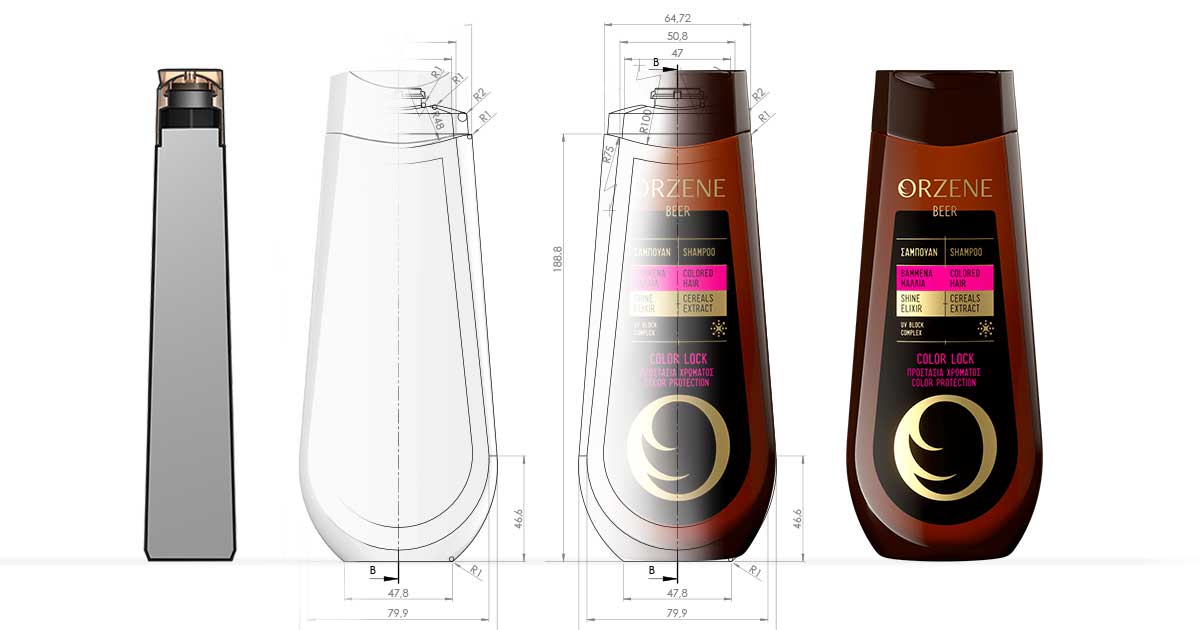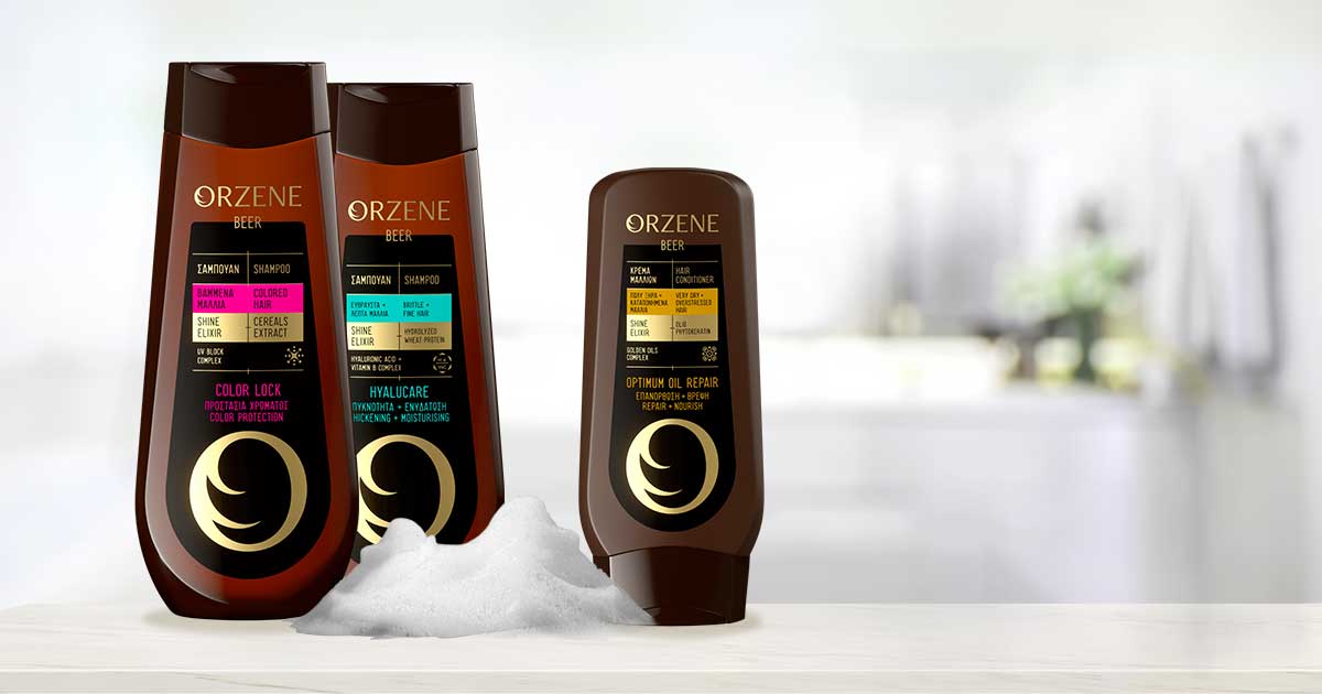
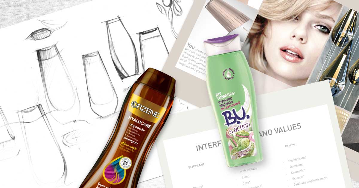
The scope of the project was to create one common structural packaging design for the three different brands Orzene (Hair Care), Bioten (Shower) und B.U. (Shower).
The development of the shape therefore presupposed the definition of common, brand equity-based design elements that at the same time leveraged unique and contemporary cues and allowed for differentiation and awareness within the categories.
Three different brands with proprietary target consumers in different distribution channels packaged in one common shape language!
This was a task for one of our interdisciplinary teams, consisting of strategy, design and development to equally live up to all requirements and to create a successful packaging that strengthens the brands and can be efficiently manufactured and distributed.